What is a construction site heat map?
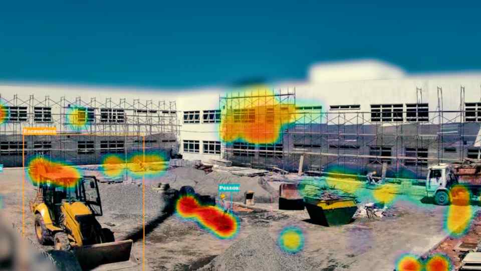
A heat map is a visual representation that uses colors to indicate the intensity of a phenomenon in different areas. In the context of construction, that phenomenon is human and machine activity — how many people, trucks or excavators were detected at each point on the site during a given period.
Areas with high activity appear in warm tones (red, orange). Areas with little or no activity appear in cool tones (blue, green). The result is an intuitive image that anyone can interpret in seconds.
How NEXO generates heat maps
The camera installed on site captures images at regular intervals throughout the day. For each image, NEXO's AI model detects and classifies objects present — people, trucks, excavators — and records their spatial coordinates in the image.
At the end of a period (daily, weekly or monthly), all these coordinates are aggregated and overlaid on the site's reference image. Maps can be filtered by object type:
- People: shows where workers circulate most frequently
- Trucks: indicates routes and stopping points for cargo vehicles
- Excavators: reveals areas of highest heavy machinery operation
What the data reveals in practice
In practice, heat maps reveal information that surprises even the most experienced managers.
Circulation bottlenecks
When many people converge on the same point frequently, it may indicate a circulation bottleneck — a narrow access, a door that is difficult to operate or a poorly positioned material staging area. Redistributing this flow can improve productivity at no additional cost.
Underutilized areas
Zones that should have activity but appear cold on the map indicate problems: lack of material, waiting for inspection or teams concentrated elsewhere when they should be distributed.
Safety zone compliance
Restricted areas that appear hot on the map indicate protocol violations. Danger zones, machine operating perimeters or hazardous material storage areas need monitoring — and the map makes these violations evident.
"A weekly heat map filtered by people revealed that 70% of workers were concentrated in just 30% of the area — which led to a flow reorganization and measurable efficiency gains."
How to use maps for decision-making
The heat map is not an end in itself — it is a starting point for questions:
- Why is there so much activity in this specific area?
- Why is this zone inactive when it should be operating?
- Is the truck flow interfering with worker circulation?
- Are machines operating in the correct areas of the site?
Managers who incorporate heat map analysis into their weekly routine report making faster and better-grounded decisions — based on objective visual evidence, not perception or memory.